
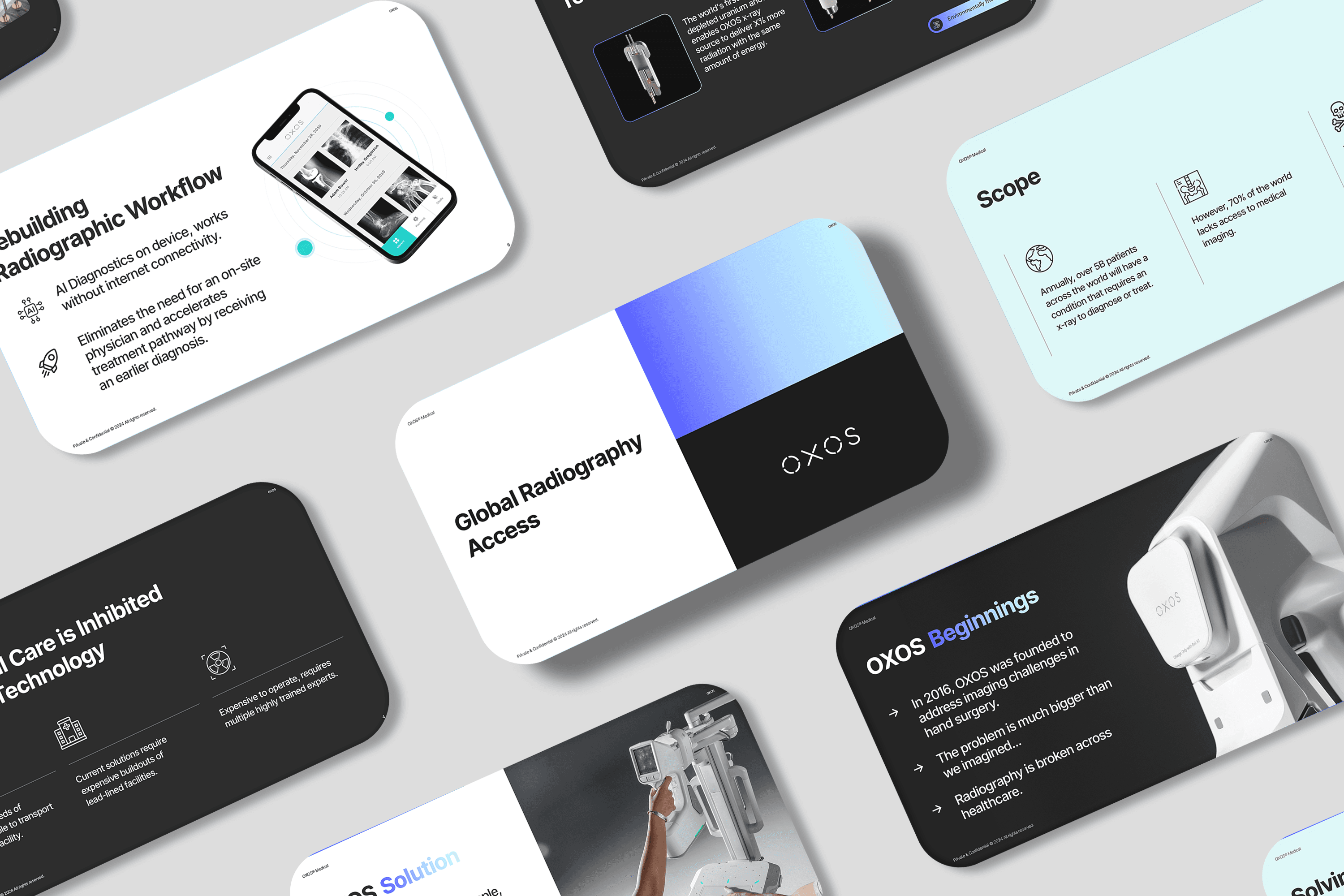
Why Good Presentation Design Matters More Than You Think
A presentation can contain a great idea and still fail to communicate it.
The problem is often not the content itself. It is how that content is structured, presented, and experienced by the audience.
Good presentation design is not simply about making slides look attractive. It helps people understand information faster, recognize what matters, and follow the story without unnecessary effort.
Whether you are preparing a pitch deck, sales presentation, company overview, proposal, or internal report, design can significantly change how your message is received.
Design Creates the First Impression
Before someone reads every word on a slide, they notice how the presentation looks.
Typography, spacing, alignment, color, imagery, and overall consistency immediately influence the impression your deck creates.
A presentation with inconsistent fonts, crowded layouts, and unclear hierarchy can make otherwise strong content feel unfinished. A well-designed presentation communicates preparation and attention to detail before the audience has fully processed the message.
For businesses, that matters.
Your presentation is often an extension of your brand.
Good Design Makes Information Easier to Understand
Business presentations frequently need to communicate complicated information in a limited amount of time.
A slide might contain financial results, market research, product information, timelines, processes, or strategic recommendations.
Simply placing that information on a slide does not make it easy to understand.
Presentation design creates hierarchy.
The most important information should receive the most visual attention. Supporting information should remain accessible without competing with the main message.
Through thoughtful typography, spacing, layout, charts, and visual grouping, a designer can turn dense information into something an audience can process much more quickly.
Every Slide Should Have a Clear Purpose
One of the most common presentation problems is trying to communicate too much at once.
A slide may contain several paragraphs, multiple charts, numerous statistics, and competing messages.
The audience then has to decide where to look first.
Strong presentations establish a clear purpose for each slide.
What is the main point?
What should the audience understand?
What information supports that point?
Once those questions are answered, the design can reinforce the intended message instead of simply decorating the content.
Consistency Builds Credibility
Professional presentations feel connected from beginning to end.
Headings follow the same hierarchy. Colors are used intentionally. Charts share a visual language. Margins remain consistent. Similar information is presented in similar ways.
These details may appear small individually, but together they create a polished experience.
Consistency also allows the audience to focus on the content rather than repeatedly adjusting to different layouts and styles.
The result is a presentation that feels considered rather than assembled.
Simple Does Not Mean Empty
Minimal presentation design is often misunderstood.
A simple slide is not necessarily a slide with very little information. It is a slide where every element has a reason to exist.
Good design removes unnecessary visual competition.
Instead of filling every available space, it uses whitespace to separate ideas and establish hierarchy. Instead of introducing several decorative elements, it focuses attention on the information that matters.
The goal is clarity, not emptiness.
Presentation Design Supports Storytelling
A presentation is more than a collection of individual slides.
It is a sequence.
Each slide should help move the audience from one idea to the next. The introduction establishes context. The following slides develop the argument or story. Supporting information provides evidence. The conclusion gives the audience a clear destination.
Design helps connect these stages.
Repeated visual patterns, section transitions, typography, and pacing can make a presentation feel like one coherent story rather than dozens of unrelated pages.
Strong Content Still Comes First
Design cannot rescue a presentation that has no clear message.
The strongest presentations combine good thinking with good communication.
Before focusing on visual design, it is worth asking:
What does the audience need to know?
What should they remember?
What action should they take afterward?
Once the content has a clear direction, presentation design can make that message easier to understand and harder to overlook.
When Professional Presentation Design Helps
Not every presentation requires a complete visual transformation.
But professional design can be particularly valuable when the presentation represents the business in an important situation.
That might include an investor pitch, sales meeting, company presentation, conference, proposal, fundraising conversation, or major internal meeting.
In these situations, the presentation is doing more than displaying information. It is helping communicate the quality of the thinking behind it.
Final Thoughts
A strong presentation should make communication feel effortless.
The audience should not have to work through inconsistent layouts, oversized paragraphs, confusing charts, or unclear hierarchy to understand the message.
Good presentation design brings structure to information, consistency to the story, and clarity to the overall experience.
The best slides rarely call attention to the amount of design work behind them.
They simply make the message easier to understand.
At Sligge, we help businesses transform existing content into clear, polished, professionally designed presentations—without losing the ideas behind the slides.