
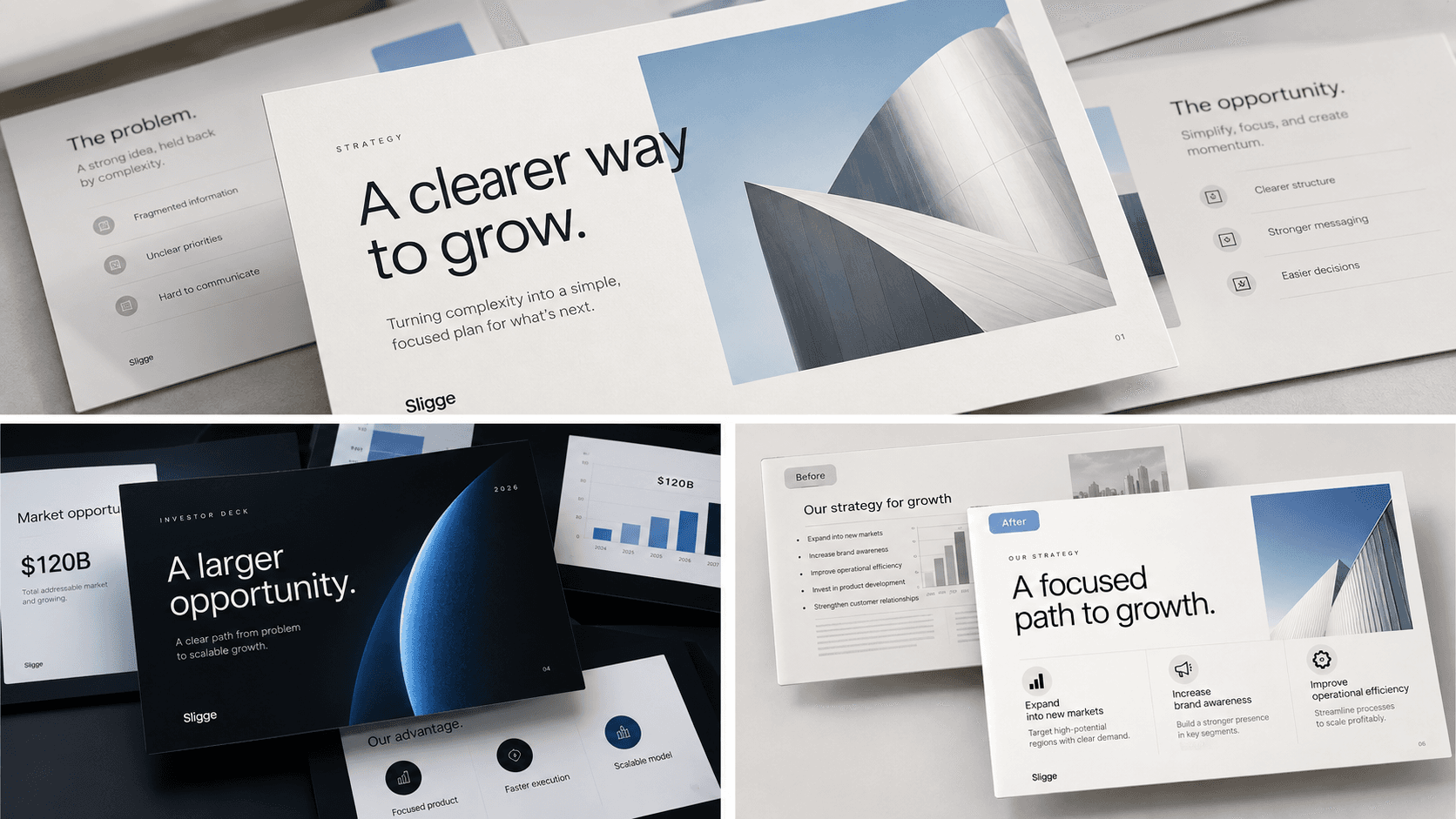
Why presentation design matters
A presentation is more than a collection of slides. Good presentation design helps an audience understand information quickly, follow the argument, and focus on what actually matters.
When hierarchy, typography, spacing, and visuals work together, even complicated information can become easier to understa

nd.
Start with a clear hierarchy
Every slide should make it obvious where the audience should look first.
A strong hierarchy usually separates:
- The main message
- Supporting information
- Data or evidence
- Secondary details
Without hierarchy, every element competes for attention. When everything looks important, nothing feels important.
Consistency makes a deck easier to follow
A presentation should feel like one visual system rather than a collection of unrelated slides.
Consistent elements can include:
- Typography
- Colors
- Margins
- Grid structure
- Chart styling
- Image treatment
Consistency does not mean every slide needs the same layout. It means different layouts still feel like they belong to the same presentation.
A strong presentation system creates consistency without making every slide look identical.
Give information enough space
Trying to fill every available part of a slide usually makes information harder to process.
Whitespace can help separate ideas, establish hierarchy, and make important information more noticeable.
A slide does not need to look empty, but every element should have enough room to do its job.
Visuals should have a purpose
Images, diagrams, charts, and illustrations should support the message rather than simply decorate the slide.
Before adding a visual, ask whether it helps explain the idea or makes the information easier to understand.
If it does neither, it may not need to be there.
Example image
Use the Image button in the editor here and select or upload an image from the Sligge media library.
The editor should insert Markdown similar to:

Test a link
You can also learn more about our presentation design services.
Video example
The following YouTube URL is intentionally placed on its own line so the Sligge blog renderer can automatically turn it into a responsive video embed.
Keep the message at the center
Presentation design works best when design decisions support the communication goal.
Typography, spacing, imagery, color, and layout should help the audience understand the message rather than compete with it.
Clarity comes first.
The visual system should make that clarity feel polished, consistent, and intentional.